In the fall of 2017, I was researching a performance problem with a job queueing system. I was trying to figure out how I could better visualize the response time of the system in order to understand what was going on and I ran across the excellent article Brandon Gregg’s Latency Heat Maps. I could not find an easy-to-use, reusable latency heat map chart component, so I decided to make my own in d3.
This post is part 4/4 of my Visualizing Latency series.
Allow me to wrap up my visualizing latency post series by noting that my official D3 latency heatmap repository is at https://github.com/sengelha/d3-latency-heatmap/. Monitor this repository for future developments to the D3 latency heatmap chart.
This post is part 3/4 of my Visualizing Latency series.
Now that I have introduced the D3 latency heatmap chart component and explained what binning is, I can discuss the primary use case of the chart: rendering event data.
What is event data First, I must explain what I mean by event data. For a fuller treatment, please read Analytics For Hackers: How To Think About Event Data, but allow me to summarize: Event data describes actions performed by entities.
Read more...
This post is part 2/4 of my Visualizing Latency series.
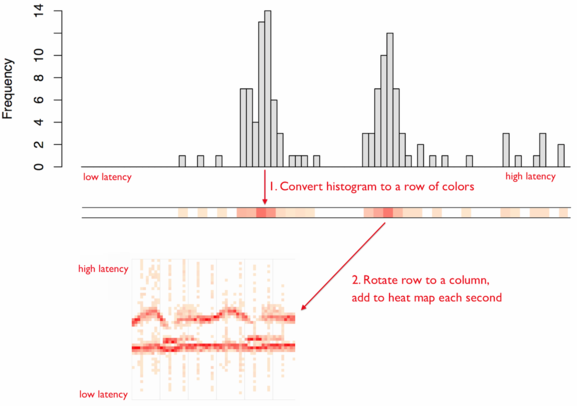
As mentioned in Brendan Gregg’s Latency Heat Maps page, a latency heat map is a visualization where each column of data is a histogram of the observations for that time interval. Using Brendan Gregg’s visualization:
As with histograms, the key decision that needs to be made when using a latency heat map is how to bin the data. Binning is the process of dividing the entire range of values into a series of intervals and then counting how many values fall into each interval.
Read more...
This post is part 1/4 of my Visualizing Latency series.
A latency heatmap is a particularly useful tool for visualizing latency. For a great treatment of latency heatmaps, please read Brendan Gregg’s Latency Heat Maps page and the ACM Queue article Visualizing System Latency.
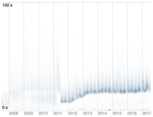
On the right, you can see a latency heatmap generated from a job queueing system which shows a number of interesting properties, not least of which is that the system appears to be getting slower over time.
Read more...