This post is part 2/4 of my Visualizing Latency series.
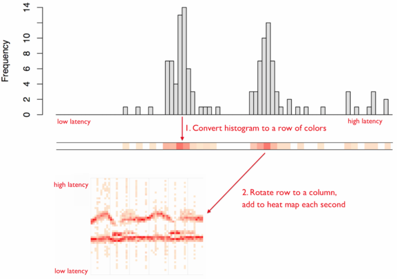
As mentioned in Brendan Gregg’s Latency Heat Maps page, a latency heat map is a visualization where each column of data is a histogram of the observations for that time interval. Using Brendan Gregg’s visualization:
As with histograms, the key decision that needs to be made when using a latency heat map is how to bin the data. Binning is the process of dividing the entire range of values into a series of intervals and then counting how many values fall into each interval. That said, there is no “best” number of bins, and different bin sizes can reveal different features of the data. Ultimately, the number of bins depends on the distribution of your data set as well as the size of the rendering area.
With latency heatmaps, binning often must be performed twice: once for the x-axis (time) and once for the y-axis (interval of observed values).
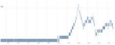
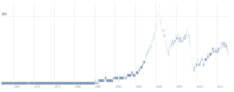
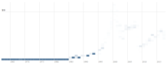
Allow me to demonstrate this visually. Here is an Excel file with the historical daily stock price of GE, courtesy of Yahoo! Finance. I have rendered the close prices in D3 Latency Heatmap with four different binning strategies:
| 12 vertical bins | 30 vertical bins | |
|---|---|---|
| Bin by year-month |
|
|
| Bin by year |
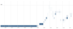
|
|
As you can see, each chart shows a slightly different perspective.
You may find you need to experiment with multiple binning strategies until you arrive at a latency heatmap chart with the appropriate level of detail for your use case.